Simple Page Guide
This guide walks you through the creation of a very simple page in the Krateo Composable Portal. By the end of the guide, you will have:
- a
Buttonwidget - a
Pagewidget that acts as a container for theButtonwidget - a navigation entry in the sidebar that links to the
Pagewidget
To follow this guide, you need to run the Krateo frontend locally. This requires:
- a running Kubernetes cluster (for example, a local
kindcluster), - the Krateo frontend codebase,
- the ability to create and edit Kubernetes resources as YAML files.
Refer to the installation guide in the repository README for setup instructions.
Creating a Button Widget
To create a Button widget, you need to define it as a Kubernetes resource using a YAML file that follows the widget schema described in the Widgets API Reference. Applying the resource will both create the widget and validate its configuration.
As a starting point, create a pre-defined Button widget by running:
kubectl apply -f docs/guides/simple-page/guide-simple-button.yaml
To verify that the widget has been created successfully, run:
kubectl get button -n simple-guide
Showing the Button Inside a Page Widget
At this point, the Button widget exists in the cluster, but it is not yet visible in the UI. Widgets become visible only when they are rendered by another visible widget.
To display the button, we will create a Page widget and reference the Button widget from it:
kubectl apply -f https://raw.githubusercontent.com/krateoplatformops/frontend/6021fda511c9ee19db6cc694fbc9cc3d15c7da3c/docs/guides/simple-page/guide-simple-page.yaml
By inspecting the Page widget definition, you can see that the Button widget is referenced by name inside spec.resourcesRefs and assigned an identifier (simple-button-id).
Declaring resources in spec.resourcesRefs is how Krateo knows which widgets to load. References can be defined statically, as in this example, or generated dynamically using resourcesRefsTemplate (see the related section in the documentation for more details).
This referencing mechanism applies to all widgets and is the foundation of widget composition in Krateo.
Making the Page Reachable
Even though the Page widget has been created, it is not yet accessible from the UI. Pages must be linked from the navigation menu to be reachable.
Creating a Sidebar Link
To expose the page, create a NavMenuItem widget:
kubectl apply -f docs/guides/simple-page/guide-simple-navmenuitem.yaml
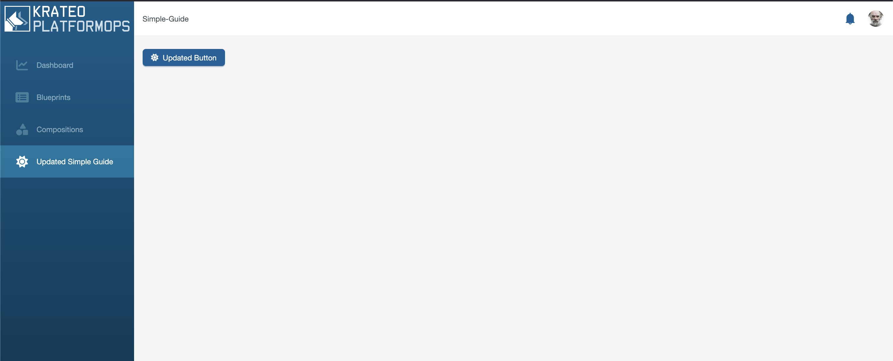
The frontend logic will automatically create a sidebar entry to the newly created Page widget, which will be visible after refreshing the UI.

Visiting the Page
Clicking the new sidebar item navigates to the path defined in the NavMenuItem widget, which in turn references the Page widget. You should now see the Button rendered on the page. For mocking purposes, clicking on the Button widget should redirect you to the current page.

Recap
In this guide, we declaratively created the following widget hierarchy:
NavMenuItem → Page → Button
Widgets reference other widgets using spec.resourcesRefs and render them by referring to the corresponding IDs inside spec.widgetData.
This composition model allows complex UIs to be built from small, reusable building blocks.
Testing the Declarative Nature of Widgets
To see the declarative model in action, try editing the spec.widgetData.label field in either guide-simple-button.yaml or guide-simple-navmenuitem.yaml, then re-apply the resources:
kubectl apply -f https://raw.githubusercontent.com/krateoplatformops/frontend/6021fda511c9ee19db6cc694fbc9cc3d15c7da3c/docs/guides/simple-page/guide-simple-navmenuitem.yaml
kubectl apply -f https://raw.githubusercontent.com/krateoplatformops/frontend/c52804d57a35ed7989d41d71461917b6d2898b43/docs/guides/simple-page/guide-simple-button.yaml
After refreshing the UI, the changes will be immediately reflected.
Next Steps
A Button widget that does nothing is not very useful. In the next guide, you will learn how to configure a Button widget to trigger an action when clicked.
Next: Action Button